<!-- Placez ce style dans votre CSS global ou directement en haut de votre template -->
<style><!--
/* Par défaut (PC) */
.hide-on-mobile {
display: block !important;
}
.show-on-mobile {
display: none !important;
}
/* Tablettes et smartphones (écrans ≤ 1024px) */
@media only screen and (max-width: 1024px) {
.hide-on-mobile {
display: none !important;
}
.show-on-mobile {
display: block !important;
}
}
--></style>
<!-- CONTENU VISIBLE SUR PC SEULEMENT -->
<div class="hide-on-mobile">
<div class="widget-container"><!-- -->
<div class="widget-row">
<p>
<p></p>
<p>
Le setup de vos rêves commence ici.
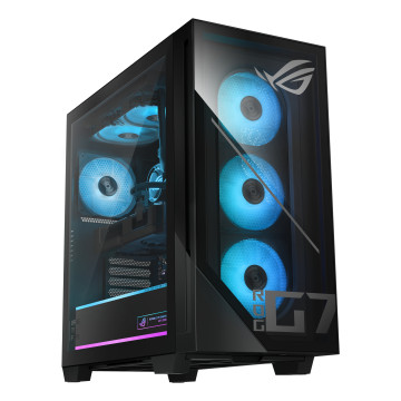


ASUS PC Gamer ROG G700 Intel Core Ultra 7 265F Haute Performance
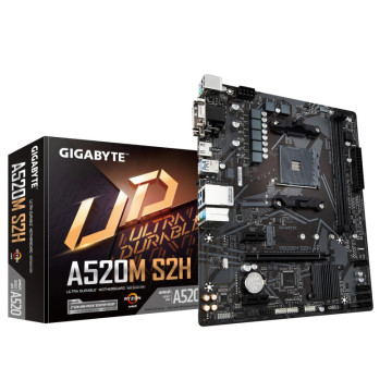

Gigabyte Carte Mère A520M S2H DDR4 Reconditionnée
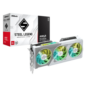

ASROCK Radeon RX 9060 XT Steel Legend 8GB OC
</div>
<p class="title-center">




<div class="widget-row" style="margin-top: 0;"></div>
<div class="widget-row">


<div class="widget-row"></div>
<div class="widget-row"></div>
<div class="widget-row"></div>
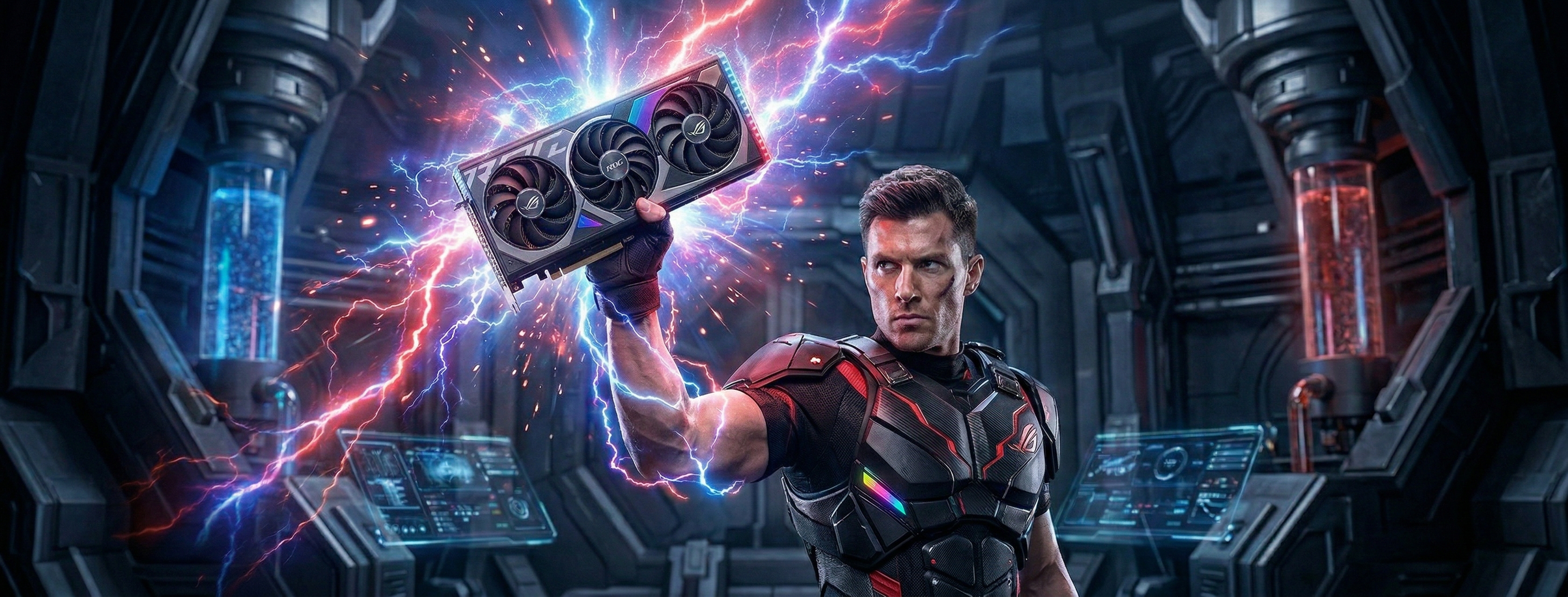
<div class="widget-row" style="text-align: center;"><span style="font-size: x-large; color: #293170;"> <strong>Puissance de jeu sans compromis : AMD ou NVIDIA, l'ultime performance !</strong> </span></div>
<div class="widget-row">
<p>


</div>
</div>
<p class="title-center" style="margin-top: 90px; text-align: center;"><span style="font-size: x-large; color: #293170;"> <strong>Nos <span class="blue">clients vous disent tout !</span></strong> </span></p>
<div class="widget-row" style="margin-top: -55px;">
<p>


</div>
<p class="title-center" style="margin-top: 30px; text-align: center;"><span style="color: #293170;"> <strong><span style="font-size: x-large;"><span class="black">Nos</span> plus grandes marques</span></strong> </span></p>
<div class="widget-row">
<p>


<p>


</div>
</div>